Vet Dynamics Index is designed to work on any browser on any computer.
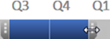
Slicers
To be able to quickly and easily scan your progress you can slice through the data with the Slicers for Procedures and Calculations, Months or Timeline.
To compare a related subset of data a continuous set can be viewed by clicking and dragging within a Slicer.
Because the Slicers have been set up with related information close together, often you will click on the first button then hold down the Shift key while clicking on the last button.
Selection
Often you will need to extend a selection, simply hold down the Shift key while clicking on another button or extend a selection in the Timeline by dragging the edges to left or right.
To see non-continuous points such as one month every year click on the first button then hold down the Ctrl key while clicking on another button.
The usual period to review is 2 years so the graph and table line up when 24 months are selected, allowing quick reading from one to the other.
To gain the benefit of both the monthly detail and the trend over 2 years the graph has the actual data points and also a lighter trend line.
Red, Amber & Green Traffic Lights
Colours have been used to highlight trends both across time and also down the long list of procedures and calculations. The red-amber-green traffic lights refers to the data in that row with the worst being red and the best being green.
![]()
For euthanasias and cheaper consults this means a higher number is worse and therefore red.
![]()
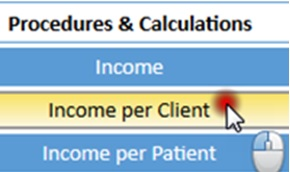
In order to understand the different aspects of your practice the table covers three areas of your practice:
- Financial Measures come first from income to prescription fees
- Marketing from vaccinations to diets
- Clinical performance from lab work to euthanasias